Twitter Sentiment Analysis with Python
Scrape Twitter data and analyze trends in sentiment over time


A few months back, I wrote an article called "Sentiment analysis of the biggest YouTube feud of all time."
A couple of years ago, two YouTubers, James Charles and Tati Westbrook, got into a huge public feud. They made videos painting each other in a bad light, and their argument went viral.
The public had conflicting opinions of this feud. Some people supported James, while others supported Tati.
In the article I wrote previously, I performed a sentiment analysis of public opinion surrounding their rivalry.
I scraped data from YouTube and Twitter to better understand what people really thought about this feud, and if their opinions changed over time.
In this article, I will walk you through all the steps I took to perform that analysis.
We will begin by scraping and storing Twitter data. We will then classify the Tweets into positive, negative, or neutral sentiment with a simple algorithm.
Then, we will build charts using Plotly and Matplotlib to identify trends in sentiment.
Step 1: Data collection
Since the feud between James and Tati took place in 2019, we will scrape Tweets from that time.
We can do this with the help of a library called Twint. First, install this library with a simple pip intall twint .
Now, let's run the following lines of code:
import nest_asyncio
nest_asyncio.apply()

import twint

c = twint.Config()

c.Search = ['#jamescharles']
c.Limit = 50000
c.Store_csv = True
c.Since = '2019-01-01'
c.Output = "jamescharles.csv"

twint.run.Search(c)
The above lines of code will scrape 50K Tweets with the hashtag #jamescharles from January 2019.
After successfully running the above lines of code, we can save the Tweets in a csv file:
import pandas as pd
df = pd.read_csv('jamescharles.csv')
Let's now take a look at some of the variables present in the data frame:
df.info()
The data frame has 35 columns, and I've only attached a screenshot of half of them.
The most main variables we will be using in this analysis are date and tweet.
Let's take a look at a sample Tweet in this dataset, and see if we can predict whether it is positive or negative:
df['tweet'][10]After running the above line of code, we can see the following sentence:
'People still finding out that youtubers like #gabbiehanna, #JakePaul, #LoganPaul, #jeffreestar, #jamescharles etc etc etc are terrible people. Wake up people. Stop being morons.'
Step 2: Sentiment Analysis
The Tweet above is clearly negative.
Let's see if the model is able to pick up on this, and return a negative prediction.
Run the following lines of code to import the NLTK library, along with the SentimentIntensityAnalyzer (SID) module.
import nltk
nltk.download('vader_lexicon')
from nltk.sentiment.vader import SentimentIntensityAnalyzer

sid = SentimentIntensityAnalyzer()

import re
import pandas as pd
import nltk
nltk.download('words')
words = set(nltk.corpus.words.words())
The SID module takes in a string and returns a score in each of these four categories - positive, negative, neutral, and compound.
The compound score is calculated by normalizing the positive, negative, and neutral scores. If the compound score is closer to 1, then the Tweet can be classified as positive. If it is closer to -1, then the Tweet can be classified as negative.
Let's now analyze the above sentence with the sentiment intensity analyzer.
sentence = df['tweet'][0]
sid.polarity_scores(sentence)['compound']
The output of the code above is -0.6249, indicating that the sentence is of negative sentiment.
Great!
Let's now create a function that predicts the sentiment of every Tweet in the dataframe, and stores it as a separate column called 'sentiment.'
First, run the following lines of code to clean the Tweets in the data frame:
def cleaner(tweet):
    tweet = re.sub("@[A-Za-z0-9]+","",tweet) #Remove @ sign
    tweet = re.sub(r"(?:\@|http?\://|https?\://|www)\S+", "", tweet) #Remove http links
    tweet = " ".join(tweet.split())
    tweet = tweet.replace("#", "").replace("_", " ") #Remove hashtag sign but keep the text
    tweet = " ".join(w for w in nltk.wordpunct_tokenize(tweet)
         if w.lower() in words or not w.isalpha())
    return tweet


df['tweet_clean'] = df['tweet'].apply(cleaner)
Now that the Tweets are cleaned, run the following lines of code to perform the sentiment analysis:
word_dict = {'manipulate':-1,'manipulative':-1,'jamescharlesiscancelled':-1,'jamescharlesisoverparty':-1,
            'pedophile':-1,'pedo':-1,'cancel':-1,'cancelled':-1,'cancel culture':0.4,'teamtati':-1,'teamjames':1,
            'teamjamescharles':1,'liar':-1}

import nltk
nltk.download('vader_lexicon')
from nltk.sentiment.vader import SentimentIntensityAnalyzer

sid = SentimentIntensityAnalyzer()
sid.lexicon.update(word_dict)

list1 = []
for i in df['tweet_clean']:
    list1.append((sid.polarity_scores(str(i)))['compound'])
The word_dict created above is a dictionary of custom words I wanted to add into the model. Words like 'teamjames' mean that people's sentiment around James Charles is positive, and that they support him.
The dictionary used to train the sentiment intensity analyzer wouldn't already have these words in them, so we can update it ourselves with custom words.
Now, we need to convert the compound scores into categories - 'positive', 'negative', and 'neutral.'
df['sentiment'] = pd.Series(list1)

def sentiment_category(sentiment):
    label = ''
    if(sentiment>0):
        label = 'positive'
    elif(sentiment == 0):
        label = 'neutral'
    else:
        label = 'negative'
    return(label)

df['sentiment_category'] = df['sentiment'].apply(sentiment_category)
Let's take a look at the head of the data frame to ensure everything is working properly:
df = df[['tweet','date','id','sentiment','sentiment_category']]
df.head()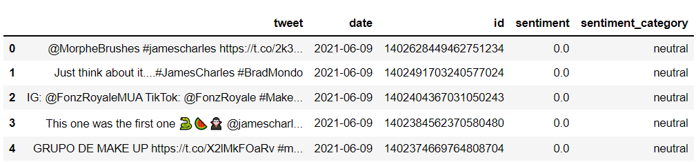
Notice that the first few Tweets are mostly of neutral sentiment.
For this analysis, we will only be using Tweets with positive and negative sentiment, since we want to visualize how stronger sentiments have changed over time.
Step 3: Visualization
Now that we have Tweets classified as positive and negative, let's take a look at changes in sentiment over time.
We first need to group positive and negative sentiment and count them by date:
neg = df[df['sentiment_category']=='negative']
neg = neg.groupby(['date'],as_index=False).count()

pos = df[df['sentiment_category']=='positive']
pos = pos.groupby(['date'],as_index=False).count()

pos = pos[['date','id']]
neg = neg[['date','id']]
Now, we can visualize sentiment by date using Plotly, by running the following lines of code:
import plotly.graph_objs as go

fig = go.Figure()
for col in pos.columns:
    fig.add_trace(go.Scatter(x=pos['date'], y=pos['id'],
                             name = col,
                             mode = 'markers+lines',
                             line=dict(shape='linear'),
                             connectgaps=True,
                             line_color='green'
                             )
                 )

for col in neg.columns:
    fig.add_trace(go.Scatter(x=neg['date'], y=neg['id'],
                             name = col,
                             mode = 'markers+lines',
                             line=dict(shape='linear'),
                             connectgaps=True,
                             line_color='red'
                             )
                 )
fig.show()
You should see a chart that looks like this:
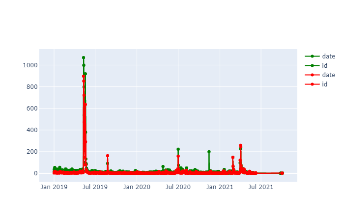
The red line represents negative sentiment, and the green line represents positive sentiment.
Observe that there is a spike in both positive and negative sentiment around May-June 2019. This makes sense, since that was when the feud between James and Tati took place.
There is a huge spike in the number of hashtags mentioning James Charles - it went from around 50 tweets a day to over 1K.
Let's now zoom into May-June 2019, and take a look at sentiment breakdown during the feud.
# filter the df to only capture Tweets from the start of May to end of June

newdf = df[(df['date']>='2019-05-01') & (df['date']<='2019-06-29')]

neg = newdf[newdf['sentiment_category']=='negative']
neg = neg.groupby(['date'],as_index=False).count()

pos = newdf[newdf['sentiment_category']=='positive']
pos = pos.groupby(['date'],as_index=False).count()

pos = pos[['date','id']]
neg = neg[['date','id']]
Now, run the following lines of code to create a time series chart again:
import plotly.graph_objs as go

fig = go.Figure()
for col in pos.columns:
    fig.add_trace(go.Scatter(x=pos['date'], y=pos['id'],
                             name = col,
                             mode = 'markers+lines',
                             line=dict(shape='linear'),
                             connectgaps=True,
                             line_color='green'
                             )
                 )

for col in neg.columns:
    fig.add_trace(go.Scatter(x=neg['date'], y=neg['id'],
                             name = col,
                             mode = 'markers+lines',
                             line=dict(shape='linear'),
                             connectgaps=True,
                             line_color='red'
                             )
                 )
fig.show()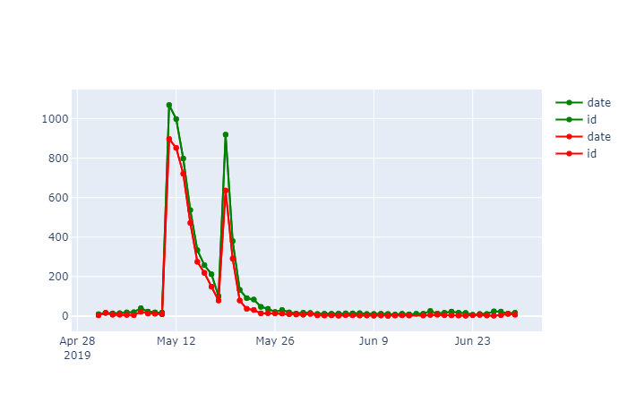
There is a spike in both negative and positive sentiment on May 11 2019. We see 10X more tweets than we normally would.
This is because May 11th was the date Tati Westbrook uploaded a video painting James Charles in a negative light. This video went viral very fast, and Tweets came pouring in from people all over the world.
Now, let's take a look at some word clouds to see what people have to say about the situation.
First, let's look at the most prominent positive words:
import matplotlib.pyplot as plt
from wordcloud import WordCloud
df2 = df[(df['date']>='2019-05-11') & (df['date']<='2019-05-14')]
positive = df2[df2['sentiment_category']=='positive']
wordcloud = WordCloud(max_font_size=50, max_words=500, background_color="white").generate(str(positive['tweet_clean']))
plt.figure()
plt.imshow(wordcloud, interpolation="bilinear")
plt.axis("off")
plt.show()
The following chart will be rendered:
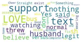
The positive words with the hashtag 'jamescharles' are love, support, believe, and legit.
These people are on James' side of the feud, and they love and support him despite
neg = df[df['sentiment_category']=='negative']
neg = neg.groupby(['date'],as_index=False).count()

pos = df[df['sentiment_category']=='positive']
pos = pos.groupby(['date'],as_index=False).count()

pos = pos[['date','id']]
neg = neg[['date','id']]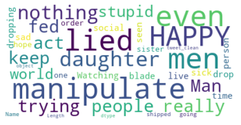
The negative comments seem to be from people who think that James Charles is a liar and manipulator. There are words like 'nothing', 'stupid,' 'act,' and even 'happy' in these Tweets.
That's all for this analysis!
If you followed along to this tutorial, I hope you learnt something new from it.
The tools used for this analysis are Twint (to scrape Twitter), NLTK (for sentiment analysis), and Plotly/Matplotlib (for data visualization).
Every month, I send out the best of my writing to followers via e-mail. You can subscribe to my free newsletter to get this delivered straight to your inbox.