Build a Dash app with Python in 7 minutes
Create a beautiful visualization app with Python from scratch

When I started working on my capstone project a few months ago, I wanted to create an interactive dashboard for my machine learning model.
I wanted this dashboard to be in the form of a web application and display live updates as new data entered the system.
After exploring many visualization tools, I decided to go with Dash.
Dash is an open-source library that allows you to create interactive web applications in Python.
If you use Python regularly to build data visualizations, Dash is the perfect tool for you. You can create a GUI around your data analysis and allow users to play around with your dashboard application.
The best thing about Dash is that it allows you to build these things purely in Python. You can create web components without having to write any HTML or Javascript code.
In this tutorial, I will show you how to create a simple data visualization application with Dash.
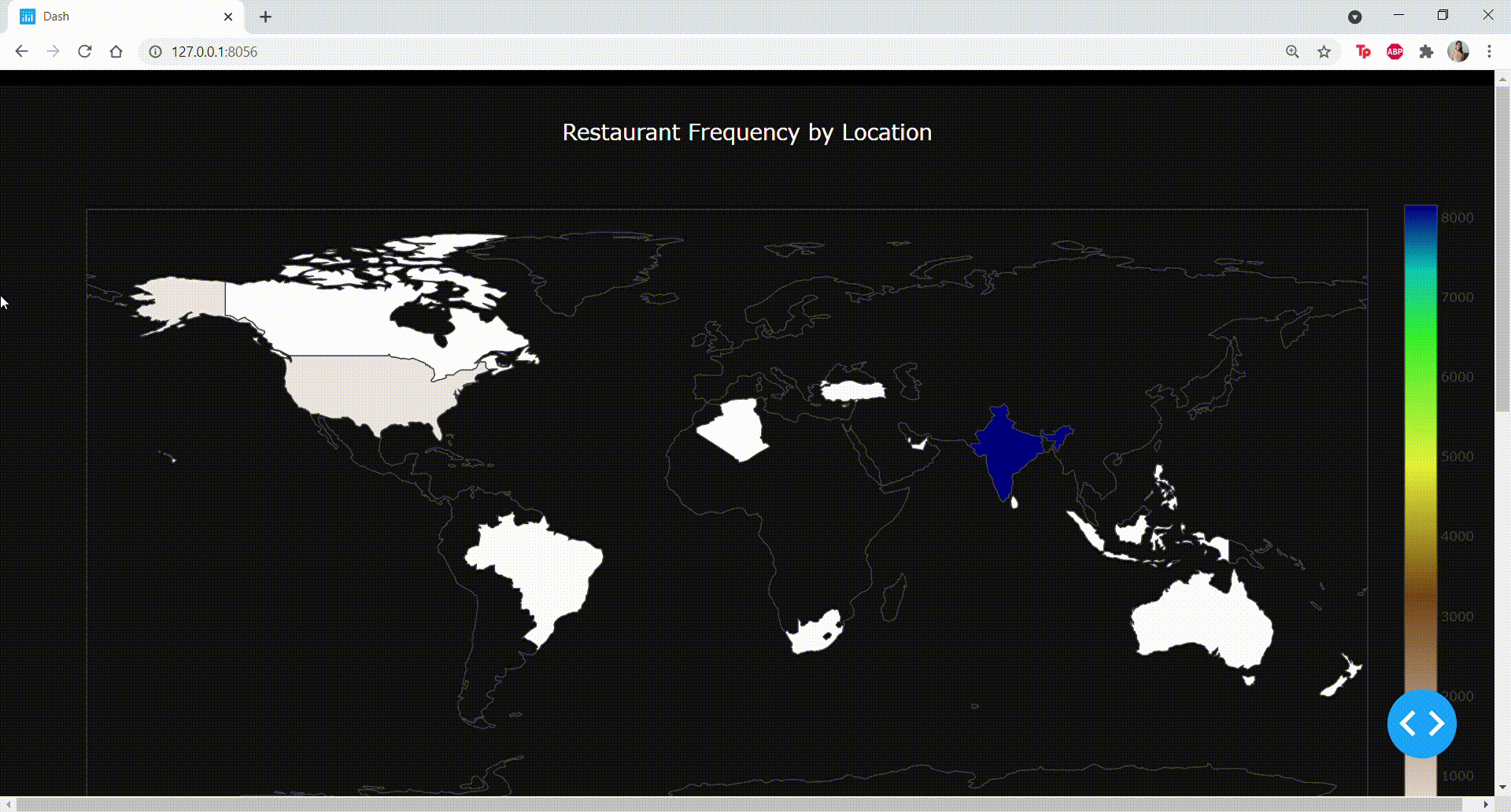
The end product will look like this:
Step 1: Pre-requisites
Before we start building the app, you will need to have:
- A Python IDE: I'm using Visual Studio Code for this analysis, but any Python IDE will work (Except for Jupyter Notebooks).
- Libraries: Install Dash, Pycountry, Plotly, and Pandas
- Data: I used the Zomato Kaggle Dataset to build the web app. I made some changes to the dataset to make it suitable for this analysis, and you can find the pre-processed version here.
Step 2: Building the Dashboard
First, let's import all the necessary libraries to build the app:
import dash
import dash_core_components as dcc
import dash_html_components as html
import dash_bootstrap_components as dbc
from dash.dependencies import Input, Output, State
import plotly.graph_objs as go
import plotly.express as px
import numpy as np
import pandas as pd
If the above lines of code execute successfully, great job! All the installations worked.
Just below the imports, add this line of code to include a CSS stylesheet in your Dash app:
external_stylesheets = ['https://codepen.io/chriddyp/pen/bWLwgP.css']Then, let's initialize Dash:
app = dash.Dash(__name__, external_stylesheets=external_stylesheets)
server = app.server
Now, we can read the data frame into Pandas with the following lines of code:
df = pd.read_csv('restaurants_zomato.csv',encoding="ISO-8859-1")The head of the data frame looks like this:
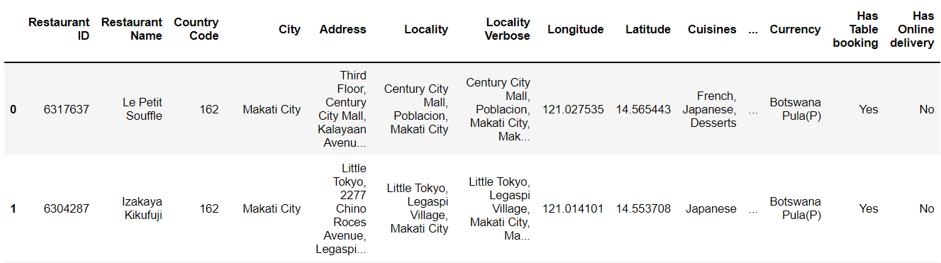
This data frame consists of restaurant data - the name of each restaurant, their location, rating, and popularity.
We will visualize some of this data on our Dash app.
We will create three charts to display on our Dash app - a map, a bar chart, and a pie chart.
Let's start with the map.
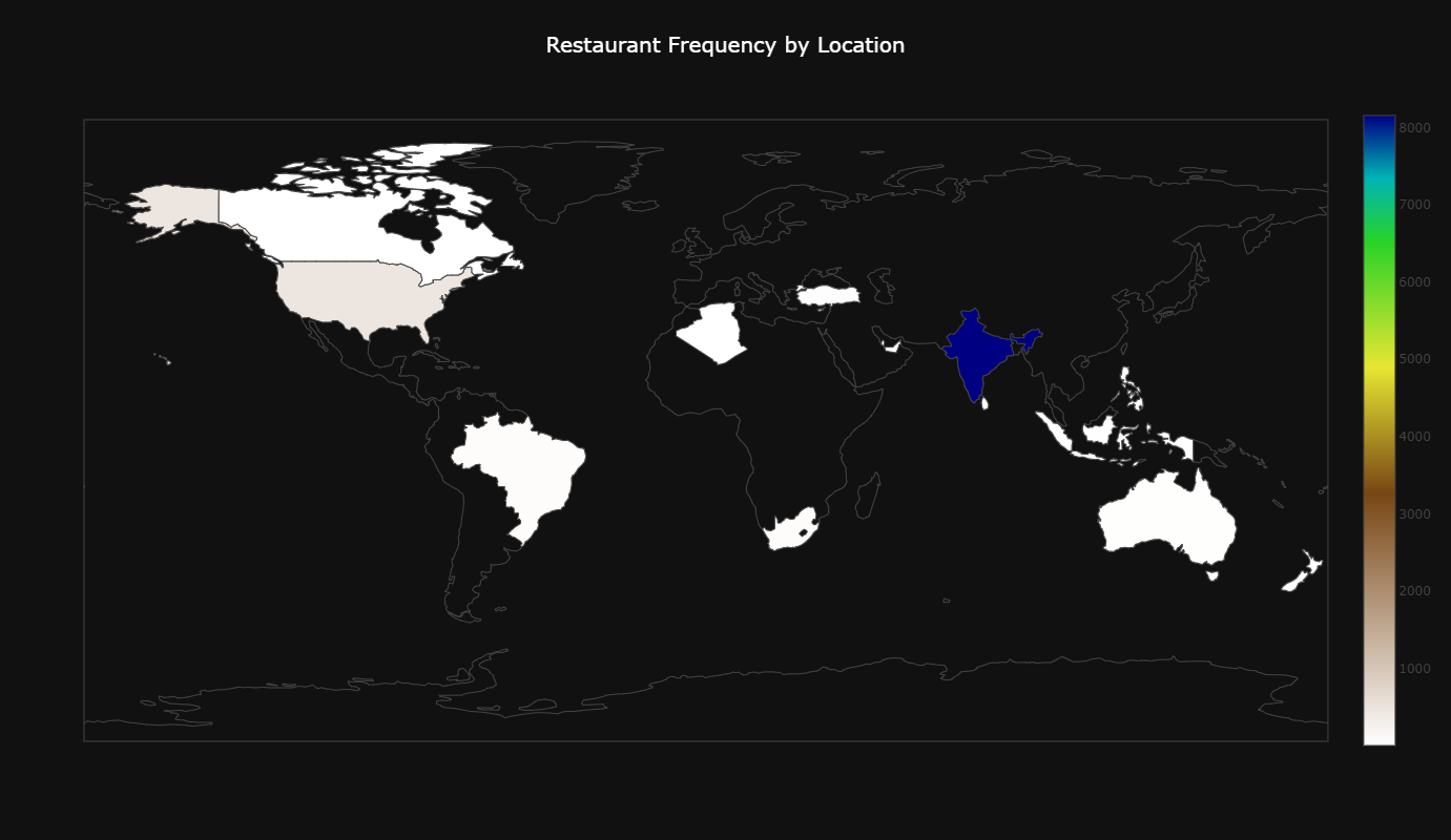
We will visualize the number of restaurants present in the dataset by country. The end product will look like this:
We will be using the 'country_iso' column in the dataset to do this. We need to count the number of restaurants in for each country and create a new 'count' column, which can be done with the following lines of code:
# country iso with counts
col_label = "country_code"
col_values = "count"

v = df[col_label].value_counts()
new = pd.DataFrame({
    col_label: v.index,
    col_values: v.values
})
Great! Now, we can create the map with the 'country_iso' and 'count' columns:
hexcode = 0

borders = [hexcode for x in range(len(new))],
map = dcc.Graph(

            id='8',
            figure = {
            'data': [{
            'locations':new['country_code'],
            'z':new['count'],
            'colorscale': 'Earth',
            'reversescale':True,
            'hover-name':new['final_country'],
            'type': 'choropleth'

            }],

            'layout':{'title':dict(

                text = 'Restaurant Frequency by Location',
                font = dict(size=20,
                color = 'white')),
                "paper_bgcolor":"#111111",
                "plot_bgcolor":"#111111",
                "height": 800,
                "geo":dict(bgcolor= 'rgba(0,0,0,0)') }

                })
The above lines of code will create the map, and colour each region according to the number of restaurants listed.
Now, we can start creating the bar chart.
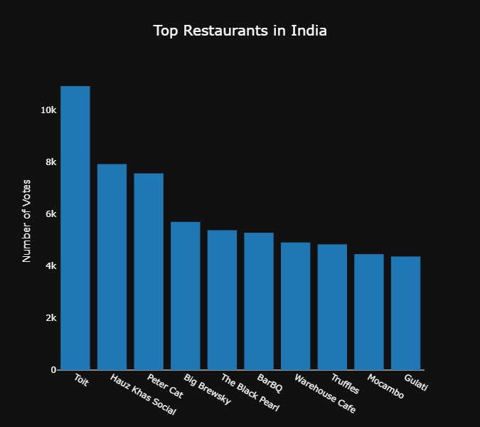
If you look at the map displayed above, India has the highest number of restaurants in the data frame. 8,155 restaurants listed in the data frame are in India.
Let's take a look at the most popular restaurants in India with the following lines of code:
df2 = pd.DataFrame(df.groupby(by='Restaurant Name')['Votes'].mean())
df2 = df2.reset_index()
df2 = df2.sort_values(['Votes'],ascending=False)
df3 = df2.head(10)

bar1 =  dcc.Graph(id='bar1',
              figure={
        'data': [go.Bar(x=df3['Restaurant Name'],
                        y=df3['Votes'])],
        'layout': {'title':dict(
            text = 'Top Restaurants in India',
            font = dict(size=20,
            color = 'white')),
        "paper_bgcolor":"#111111",
        "plot_bgcolor":"#111111",
        'height':600,
        "line":dict(
                color="white",
                width=4,
                dash="dash",
            ),
        'xaxis' : dict(tickfont=dict(
            color='white'),showgrid=False,title='',color='white'),
        'yaxis' : dict(tickfont=dict(
            color='white'),showgrid=False,title='Number of Votes',color='white')
    }})
The codes above will render a bar chart that looks like this:
(Note that you won't be able to run the codes yet until you finish creating and displaying all the components)
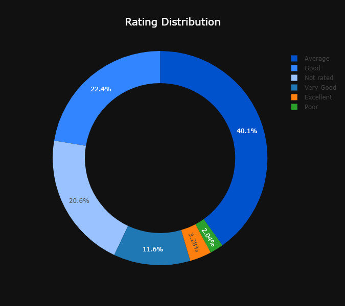
Let's create the final chart.
We will look at the overall rating distribution in the dataset:
col_label = "Rating text"
col_values = "Count"

v = df[col_label].value_counts()
new2 = pd.DataFrame({
    col_label: v.index,
    col_values: v.values
})

pie3 = dcc.Graph(
        id = "pie3",
        figure = {
          "data": [
            {
            "labels":new2['Rating text'],
            "values":new2['Count'],
              "hoverinfo":"label+percent",
              "hole": .7,
              "type": "pie",
                 'marker': {'colors': [
                                                   '#0052cc',
                                                   '#3385ff',
                                                   '#99c2ff'
                                                  ]
                                       },
             "showlegend": True
}],
          "layout": {
                "title" : dict(text ="Rating Distribution",
                               font =dict(
                               size=20,
                               color = 'white')),
                "paper_bgcolor":"#111111",
                "showlegend":True,
                'height':600,
                'marker': {'colors': [
                                                 '#0052cc',
                                                 '#3385ff',
                                                 '#99c2ff'
                                                ]
                                     },
                "annotations": [
                    {
                        "font": {
                            "size": 20
                        },
                        "showarrow": False,
                        "text": "",
                        "x": 0.2,
                        "y": 0.2
                    }
                ],
                "showlegend": True,
                "legend":dict(fontColor="white",tickfont={'color':'white' }),
                "legenditem": {
    "textfont": {
       'color':'white'
     }
              }
        } }
)
The pie chart created by the codes above will look like this:
Now that we're done creating all three charts, let's display them on the web page and run the Dash app.
We first need to come up with the page layout and structure of our web app.
The Dash components follow a grid structure (similar to CSS grid layout). Dash has three core components - rows, columns, and containers.
You can arrange these components in any way to like to fit your elements on the page.
Since we only have three charts, I came up with this simple layout:
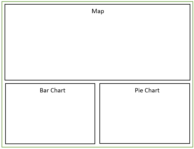
We will only use two rows for these charts, and the second row will have two columns to accommodate the bar and pie chart.
Here is some code to create a layout like this in Dash:
graphRow1 = dbc.Row([dbc.Col(map,md=12)])
graphRow2 = dbc.Row([dbc.Col(bar1, md=6), dbc.Col(pie3, md=6)])
All we need to do now is define our app layout and run the server:
app.layout = html.Div([navbar,html.Br(),graphRow1,html.Br(),graphRow2], style={'backgroundColor':'black'})

if __name__ == '__main__':
    app.run_server(debug=True,port=8056)
By default, Dash runs on port 8050. If this is in use, you can manually specify the port you want to run it on.
We're done coding the dashboard application.
Just run the Python app and navigate to the dashboard location, and you will see your visualizations:

Here is the complete code for this Dash project:
import dash
import dash_core_components as dcc
import dash_html_components as html
import dash_bootstrap_components as dbc
from dash.dependencies import Input, Output, State
import chart_studio.plotly as py
import plotly.graph_objs as go
import plotly.express as px
external_stylesheets =['https://codepen.io/chriddyp/pen/bWLwgP.css', dbc.themes.BOOTSTRAP, 'style.css']
import numpy as np
import pandas as pd

app = dash.Dash(__name__, external_stylesheets=external_stylesheets)
server = app.server

df = pd.read_csv('restaurants_zomato.csv',encoding="ISO-8859-1")

navbar = dbc.Nav()


# country iso with counts
col_label = "country_code"
col_values = "count"

v = df[col_label].value_counts()
new = pd.DataFrame({
    col_label: v.index,
    col_values: v.values
})

hexcode = 0
borders = [hexcode for x in range(len(new))],
map = dcc.Graph(
            id='8',
            figure = {
            'data': [{
            'locations':new['country_code'],
            'z':new['count'],
            'colorscale': 'Earth',
            'reversescale':True,
            'hover-name':new['country_code'],
            'type': 'choropleth'
            }],
            'layout':{'title':dict(
                text = 'Restaurant Frequency by Location',
                font = dict(size=20,
                color = 'white')),
                "paper_bgcolor":"#111111",
                "plot_bgcolor":"#111111",
                "height": 800,
                "geo":dict(bgcolor= 'rgba(0,0,0,0)') } })


# groupby country code/city and count rating
df2 = pd.DataFrame(df.groupby(by='Restaurant Name')['Votes'].mean())
df2 = df2.reset_index()
df2 = df2.sort_values(['Votes'],ascending=False)
df3 = df2.head(10)

bar1 =  dcc.Graph(id='bar1',
              figure={
        'data': [go.Bar(x=df3['Restaurant Name'],
                        y=df3['Votes'])],
        'layout': {'title':dict(
            text = 'Top Restaurants in India',
            font = dict(size=20,
            color = 'white')),
        "paper_bgcolor":"#111111",
        "plot_bgcolor":"#111111",
        'height':600,
        "line":dict(
                color="white",
                width=4,
                dash="dash",
            ),
        'xaxis' : dict(tickfont=dict(
            color='white'),showgrid=False,title='',color='white'),
        'yaxis' : dict(tickfont=dict(
            color='white'),showgrid=False,title='Number of Votes',color='white')
    }})


# pie chart - rating

col_label = "Rating text"
col_values = "Count"

v = df[col_label].value_counts()
new2 = pd.DataFrame({
    col_label: v.index,
    col_values: v.values
})

pie3 = dcc.Graph(
        id = "pie3",
        figure = {
          "data": [
            {
            "labels":new2['Rating text'],
            "values":new2['Count'],
              "hoverinfo":"label+percent",
              "hole": .7,
              "type": "pie",
                 'marker': {'colors': [
                                                   '#0052cc',
                                                   '#3385ff',
                                                   '#99c2ff'
                                                  ]
                                       },
             "showlegend": True
}],
          "layout": {
                "title" : dict(text ="Rating Distribution",
                               font =dict(
                               size=20,
                               color = 'white')),
                "paper_bgcolor":"#111111",
                "showlegend":True,
                'height':600,
                'marker': {'colors': [
                                                 '#0052cc',
                                                 '#3385ff',
                                                 '#99c2ff'
                                                ]
                                     },
                "annotations": [
                    {
                        "font": {
                            "size": 20
                        },
                        "showarrow": False,
                        "text": "",
                        "x": 0.2,
                        "y": 0.2
                    }
                ],
                "showlegend": True,
                "legend":dict(fontColor="white",tickfont={'color':'white' }),
                "legenditem": {
    "textfont": {
       'color':'white'
     }
              }
        } }
)

graphRow1 = dbc.Row([dbc.Col(map,md=12)])
graphRow2 = dbc.Row([dbc.Col(bar1, md=6), dbc.Col(pie3, md=6)])

app.layout = html.Div([navbar,html.Br(),graphRow1,html.Br(),graphRow2], style={'backgroundColor':'black'})


if __name__ == '__main__':
    app.run_server(debug=True,port=8056)
You can play around with the code and try changing the colours and layout of the charts. You can even try creating new rows and adding more charts using the dataset above.
Dash has many more functionalities than I touched on in this tutorial. You can create filters, cards, and add live updating data. If you enjoyed this tutorial, I'll write another one covering more features and functionalities of Dash.
Thanks for reading, and have a great day :)
Every month, I send out the best of my writing to followers via e-mail. You can subscribe to my free newsletter to get this delivered straight to your inbox.